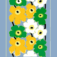
Decisions, decisions. So, now that I sourced my colors, let me rethink the design. So, this is my inspiration art, by Bjorn Wiinblad, and that inspired my bedroom color palette. Now I'm using this as my design, but it's looking a little stark. Here they are together.

Now let me show you some others that I don't like. First off, there is the matching background color, but I feel like this adds clouds to very bright flowers. Nothing is bright when it's cloudy, so this is a fail.
This is worse! What are they in front of, Donald Trump? Jeff Boehner? I think these mockups are getting worse. The color proportions just look off compared to the artwork. As for the pink, it is pretty and could be a pink, cotton candy sunset, but again, no. I think the eye needs the white space to take a break. Also, do I need to complicate the settled palette and throw off all my hard work spent yarn sourcing? No.
Now, what I could do is switch out one of the colors for the white, I'm thinking the chartreuse, and that could be the background color? Where do you find chartreuse flowers in nature? However, my wedding flowers were exclusively Stop n Shop chartreuse mums. My colors were chartreuse and all the greens and bronze. My one bridesmaid was given free choice but told green or bronze. She doesn't look good in green and so my bridesmaid wore...brown. Close enough! How many people remember that my bridesmaid was not in the metallic family? My main complaint about her was that she hadn't popped and wasn't as pregnant as the bride (why didn't she invent a time machine?) Okay, off topic.
Before I even write this paragraph about white flowers, do I even want to consider dirty white flowers? No, no I do not. But, let's try it. Okay, I do like this. It is kind of unexpected. And now the jonquil or true yellow looks chartreuse, but it is jonquil! So, two final decisions before I commit to the yarn: white background or white flowers? Now even what I term marigold is looking pretty orange, and there is a minor focus on white or near white (pale pink), echoing the tones of the picture more? It was the chartreuse that set this whole project off, so now I'm wondering, do I lose it altogether and go with the blue-grey background and these 3 distinct flower colors rather than the color family with the white background?
Okay, that's a no. So we have 2 versions to decide between. The original, unmessed with vision, or the chartreuse background with white instead of chartreuse flowers.


0 comments:
Post a Comment